Microsoft Office 2016 was a major update for the Office suite and a good amount has changed, including how to plot a “Line of Best Fit.” This guide will walk you through how to add one to your graphs with ease, as well as some other useful elements like axis labels.
Instructions
This tutorial already assumes you have your graph created with data added. Your screen might look something like this (don’t worry: this is done in a very similar way in Microsoft Word, too):
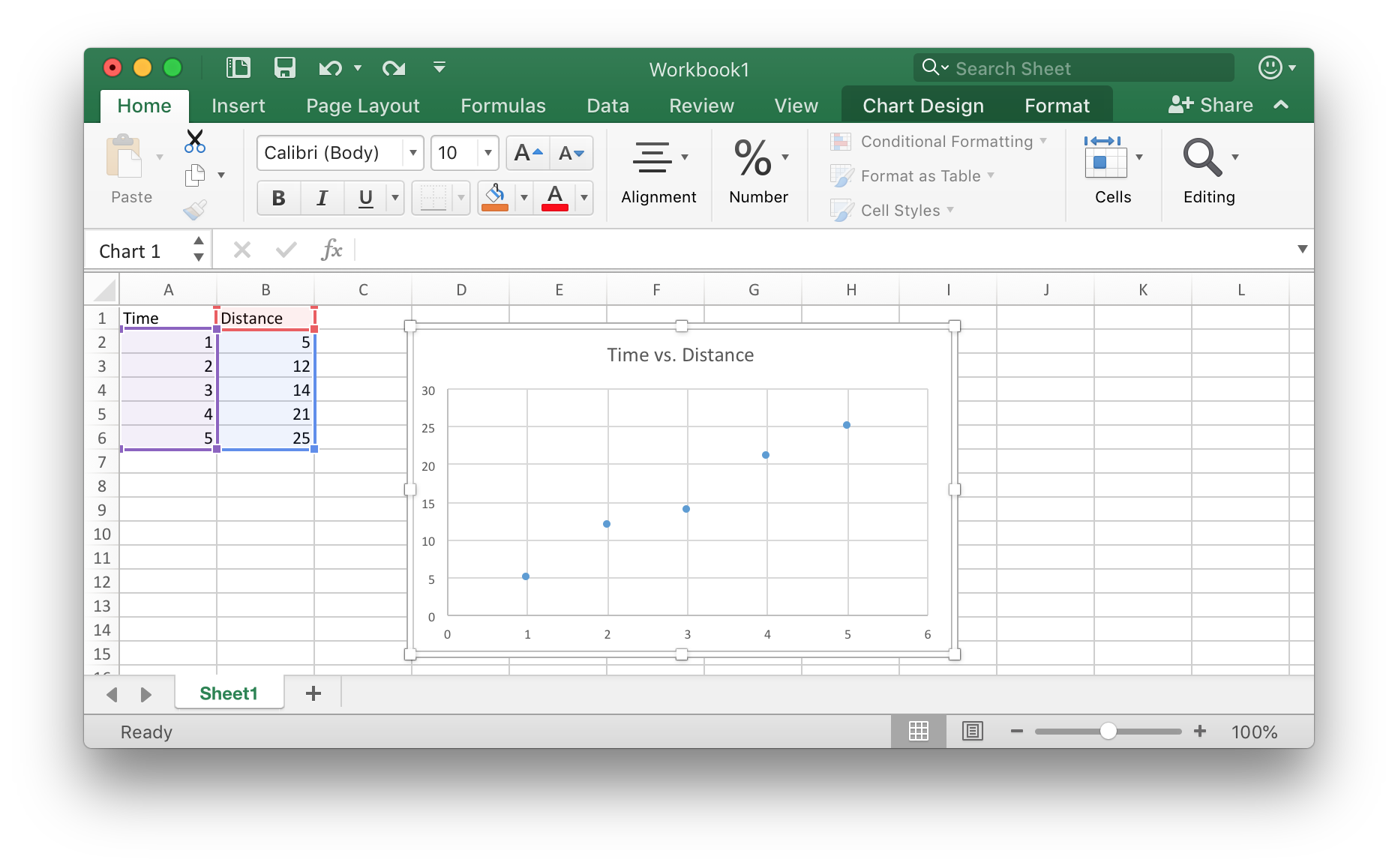
Make sure you are selecting the graph. Once you do so, you are able to go to Chart Design. Click it, and it should change the ribbon menu to show more chart-oriented options.
One of these options are to Add Chart Element. Click this, and you should be prompted with several options.
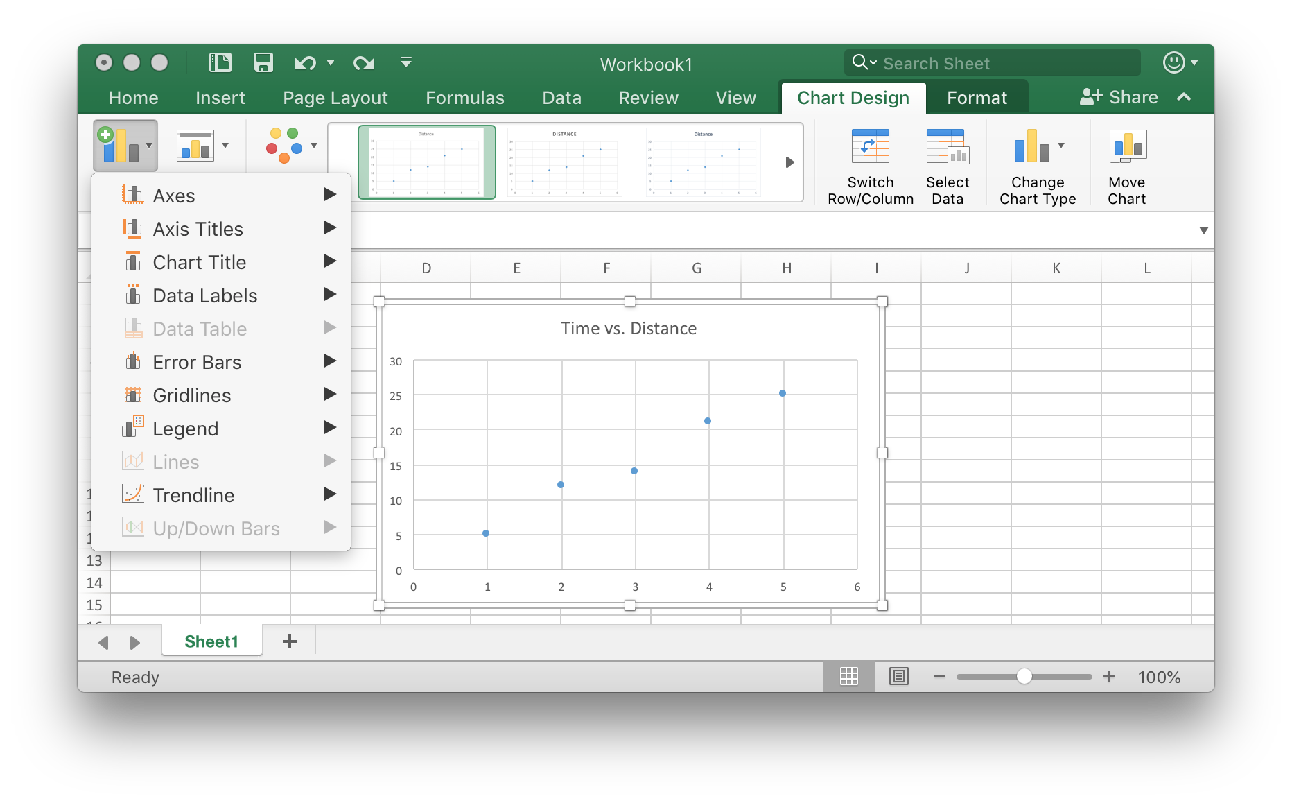
Go to Trendline, and then choose the trendline you want to add. In this case, we are going to add a Linear trendline.
Doing so should create a dotted-line between your points, which is your Line of Best Fit.
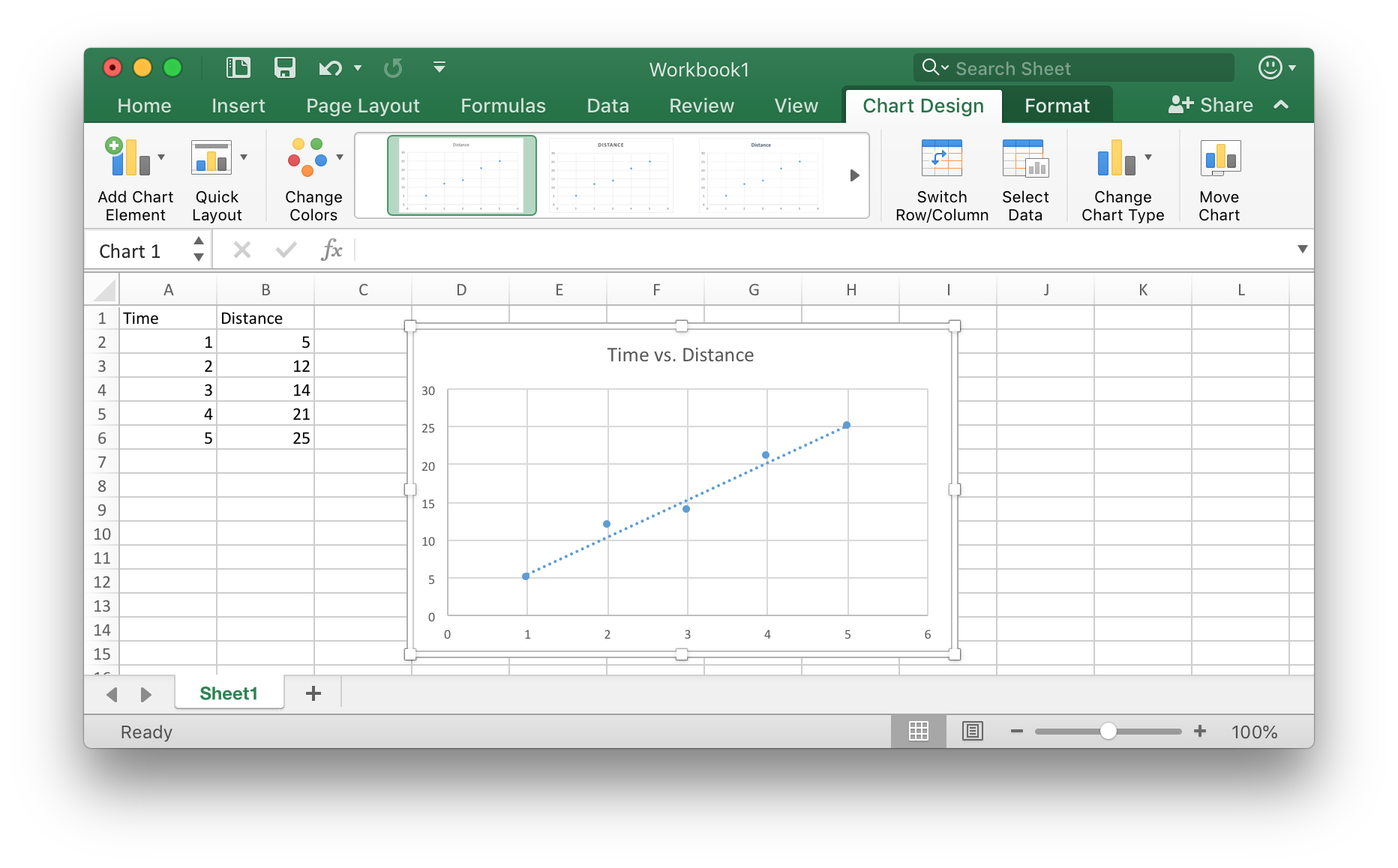
Now your Line of Best Fit is in your graph! However, there are other chart elements you can add or remove. For example, you can add axis labels, a legend (key), and remove or add gridlines. Some of these are quite useful, so adding them is probably a smart idea, especially for a school science class!